Logo tutorial
Released: 14.8.2008
Translated by: El Kamil, Sionix
Source: http://worldofrisen.de/
Copyright 2007/2008 Piranha Bytes
To find a name for a child isn't so easy. It can take some time to choose a name in pair and who has a child knows it. And now imagine, that you have 21 people and a rich godfather (in this case patient workmates from Deep Silver) to agree on one name. You can guess, that there will be couple of troubles before the christening.
The very first step was to gather the ideas (some of them weren't so bad, however they are too big spoiler, that I can't enumerate them here). Everybody in the team could have come with his own idea. After two weeks, the list of names have been cut down on five serious candidates and forwarded to Deep Silver. There were the names rigorously tested (trade mark possibilities, etc.) and we've got the feedback.
In the end only one name left:
THE DEVIL ISLAND OF NAKED BABES
Only joking:
RISEN

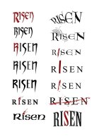
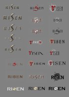
Then it was necessary to dress up the child. Kai Rosenkranz (composer and man of IT and Renaissance) was the first of us, who had a time to deal with the logo. He worked up the ideas in the picture 1. As you can see, it's easy to recognise the idea of emphasized 'S'.
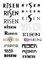
A few days later I finally got the time to look at the project on my own. First I looked at Kai's concepts and I also drew many little (often worse) concepts. In fact, that is a residue of my job as advertisement graphics artist and it means, that I prefer my own ideas. The most of those concepts you can see below.
Piranha Bytes as a studio has its own style, I think. So the new logo should correspond a bit to this style. My imagination was, that it would have been from metal and with more emphasized serifs like Mike Hoge prefered for GOTHIC logo. (Gothic logo originally comes from Mike. In the beginning of Gothic he was the Art Director.)
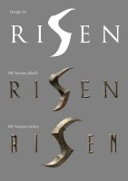
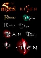
My first serious concepts you can see in the picture 2. I've kept the Kai's 'S' and for timeless look I decide to create the rest with the TIMES font. Then all in metal look - the logo is ready for presentation.
The Mike and Deep Silver's reaction were a bit restrained - but I expected that. So I invited Alex Stein from Koch Media (Deep Silver is game department) to make another concept. Sometimes the feelings of another man bring fresh wind in the whole thing.
He kept the main idea of 'S', however he made it more elegant. The body was vertically reflected and it was made from a contemporary font. I finished this concept too, and the result is in the picture 2 as the third image. There is a gray background because of the readability test - the logo must be readable in light and also in dark background.
Unfortunately a lot of people had troubles with reading the letter 'R', because it's too similar to the letter 'A'. We hoped that it could be figured out with contrast. But it didn't work. Anyway, after some time, it seemed to us that both ideas were not characteristic properly and that they were not correspond with the genre. Some adventure was missing...
Back to beginning. You mustn't let yourself discourage, the logos are the hardest weight category and rarely one of the first concepts reach the final round.
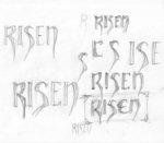
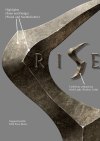
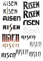
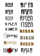
Then I tried to sketch (roughly) all possible directions to see, which one would be the most popular. Mike himself started to draw (picture 4a). These concepts and rejected directions you can find below.
Before I get to the final version created by this process, I make one short insertion about the way how I've got to the mentioned metal look:

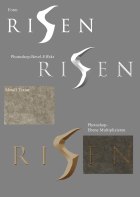
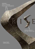
When the shape of logo is done (picture 3), I apply to logo emboss effect with roughly shaped lines through Layer Style option. It gives the logo 3D look. You find this option in Photoshop under Layer - Layer Style - Bevel and Emboss menu.
You can insert metal texture in the picture as new layer under the logo layer and set the blend mode to Multiply. A now you must to choose the transparent area in layer with logo (Magic Wand tool) and delete redundant texture from texture layer. So you have metal sign. Wasn't so hard, was it? The real obstacle is hidden in details, of course.
For getting the authentic effect of old age for metal, you have to play a little with the drawing tools and illumination, also you must emphasize light lines. Scratches can be made by smart cloning from the light and dark areas, you just have to emphasize the lines (picture 4).
Because you surely don't want to go through all of this everytime you use the logo, I recommend to create the logo in enormous size from the beginning. Width of 4000 pixels is enough for most of the purposes. But because I suppose that we will need the logo 5-6 metres wide during the trade fairs, I created it in the width of 9000 pixels.
If it won't be enough, we have to make new logo. You can see final look of the logo in picture 5.
For the posters and web sites I made even more effective version of the logo. You can create the lightening around the logo with using option Outer Glow from Layers - Layer Style menu. It was no big deal, so I applied on it the filter Motion Blur from Filters - Blur menu. To make the glow more detailed I also used a effect I had created in Knoll Light Factory. You can see the final result in the picture 6.
You can see all serious and not so serious concepts in the pictures 7 - 12.
I hope, that you enjoy the look behind the scene...
Ralf Marczinczik
Artdirector
Piranha Bytes
Image gallery
 |
 |
 |
 |
 |
 |
 |
 |
 |
 |
 |
 |
 |


© Kamil Krásný & Paulie 2007


 Articles


